
Future TV Rebrands – The Review


Future TV Rebrands – The Review
By Admin I: Rebranding shouldn’t really be a big deal in a country where the leading TV stations are blunt replicas of abc and TF1, whether talking about the visual identities or the art direction of the whole channel.
Future TV rebranded after merging its two channels in one family oriented modern channel (it’s their promise, not mine) taking a visual shift starting by a logo redesign reaching animation, studios and other online applications.
What’s mainly worth a review when it comes to Future TV is not the rebranding job by itself; it’s the channel’s visual history that played a major part in its identity as a pioneer channel during the late 90s, and again, we’re only hinting on a visual level. Future TV was the first to do clay motion, flatten 3d graphics to a minimal beautifully executed 2d visuals and animations, and had a brilliant use of patterns and culturally engaging semiotics: it was essentially the modern ‘Arab’ channel that does not look like a euro wannabe, and that was way before Dubai One, which became recently ‘the’ visual pioneer when it comes to regional TVs.
Pros and Cons are the core of this post simply because the rebranding doesn’t really put the channel in what we have earlier labeled as an ‘identity crisis’ post or a ‘we can brand’, it’s just what’s in between:
Starting by the cons (yes we like drama):
– The logo: Future TV had a 2d minimal logo that could’ve easily lived 20 more years; lifting the logo was an option but a redesign was not a good choice especially that they went back to a 3d glossy feel, as tacky and app-looking as ever! The logo shows an abstract F, or what used to be their ‘window’ icon, white and blue, playing on a pure cyan.
– The animations: They lost the 2d feel, added gradients and totally dropped their pattern influence, it is a merge between 90s gone bad and a reach to fake minimalism.
– Cultural aspects: Talking typography, Future TV has dropped their edgy unique arabic and used a very standard GE modern typeface, a bold sans-serif for Latin, and ended up looking like every other modern channel; losing their point of difference was a major sacrifice!
The pros:
– Promos: the most single interesting aspect of the rebranding job is the set layouts for the shows’ promos, a beautiful black and white treatment, a thick white frame and bold type, and yes this is how minimalism works well, indeed when it has balls* attached!
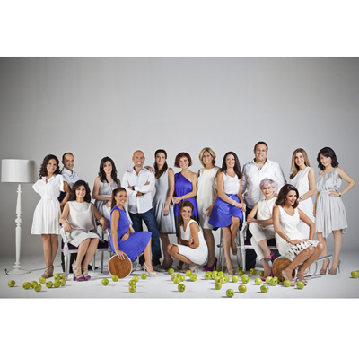
– Art direction (Production): There’s nothing more refreshing than seeing art directed work! aka: No randomness. The channel’s team went through relooking, studios were redecorated towards a cleaner look adding white spaces everywhere which looks more American than French (mtv crew/ Ashrafieh ladies can sleep tight) and can easily be considered timeless.
It’s sad when a redesign wastes potential points of strength for the sake of what they preach as newness. What is crucial here is staying true to a culture, an audience and a system of visual beliefs without being hit by a trend.. It’s all about balance, do not compromise for modernism people!

Perfectly and simply said! The logo is very disappointing on so many levels (that you guys mentioned some).
“What is crucial here is staying true to a culture, an audience and a system of visual beliefs without being hit by a trend” < unfortunately that's always the issue in re-designing an identity.
Glad we share the same insight.. thanks Nat!
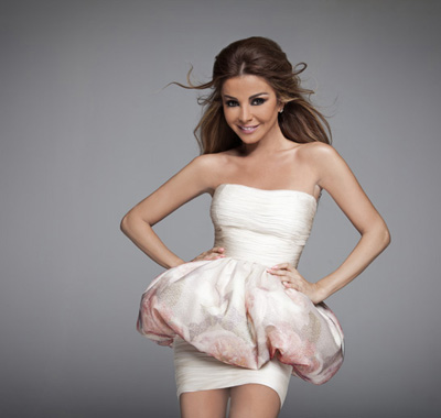
Not a fan of the redesigned brand-mark at all, but in general, the whole identity is a much needed refresh to an institution that has been failing for a while now. Regardless, it beat’s LBC’s ridiculous yearly rebrands. One thing that stands out though is the over-exagerated photoshopping! What’s up with the female presenters? They look slimmer than runway models! 🙂
haha yes I agree, rethinking their visual approach was indeed needed, and also saw the super skinny runway pictures, someone totally overused the liquify tool! the photos look very nice, but as you said, exaggerated.
I believe that the new logo is unprofessional, coz it went from simple to complicated shape, it feels that the designer is minmum 50 years old the kind that wants the logo look like the first letter of the name! The ball looks like its gonna fall so no sense of stability, and the idea of two seperate objects for a logo is weak. At least the designer could have made the ball in real 3d no just glossy and popping in low relief! The other white shape gives a disturbing contrast to the whole. Now that I gave my “professional” opinion let me just say that the logo is:
Ugly!!!!
So it’s true that Future TV is not paying its employees. Look how thin they have become.
Yes the old logo was waaaay better!
Ceci dit, la nouvelle identite sonore est juste incroyablement bonne, je viens de passer trois heures a chercher sur le Net le nom de l’agence qui aurait effectue la creation sonore, sans succes. c’est d’ailleurs comme que je suis tombe sur votre blog. Si vous avez une idee de qui pourrait bien se cacher derriere cette petite merveille de son, je vous en serai reconnaissant 🙂
nous ne savons pas!! 😦
merci pour votre commentaire!